Flip Box Shortcode
Animated flip boxes are simply awesome. We’ve never met anyone who doesn’t love these bad boys. They are great for grabbing the users attention and adding some interaction with your content. Avada’s flip boxes have fully customizable content on the front and back side. They are fully integrated with the Font Awesome icon set and icon options like spin, rotate, flip. You can put a title on the front and backside, add buttons to your content and the box height will extend based on the amount of content you use. Customize the border size, border radius and have full control over the front and backside colors. Oh yeah, and you can animate them with CSS3 goodness. These are an Avada favorite, and for good reason.
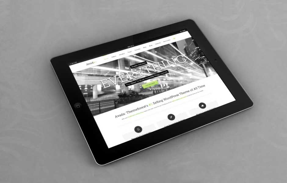
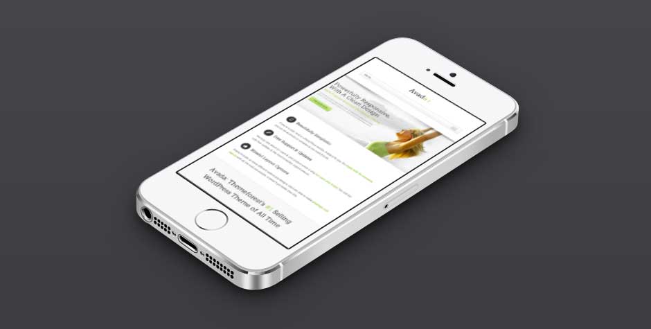
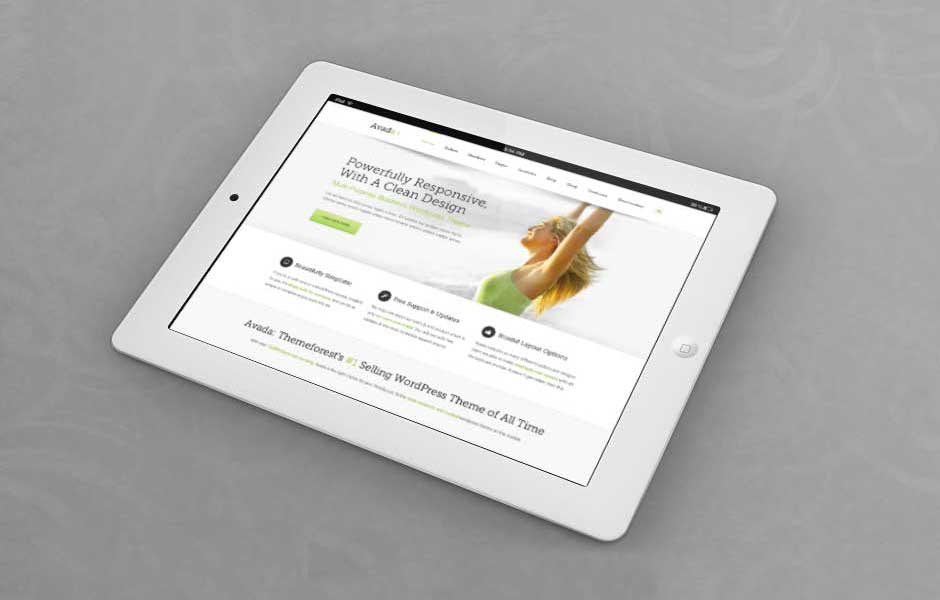
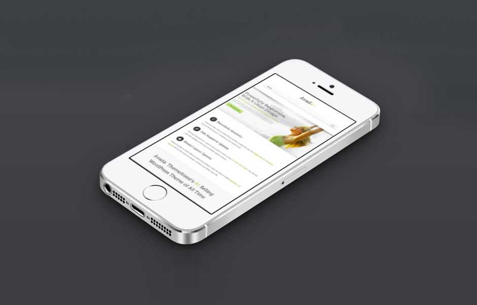
Fully Responsive
Avada's responsive framework ensures your content looks great on all screen sizes.Perfect For All Sizes
No matter the size of your screen or device, your site will look fantastic.Premium Sliders
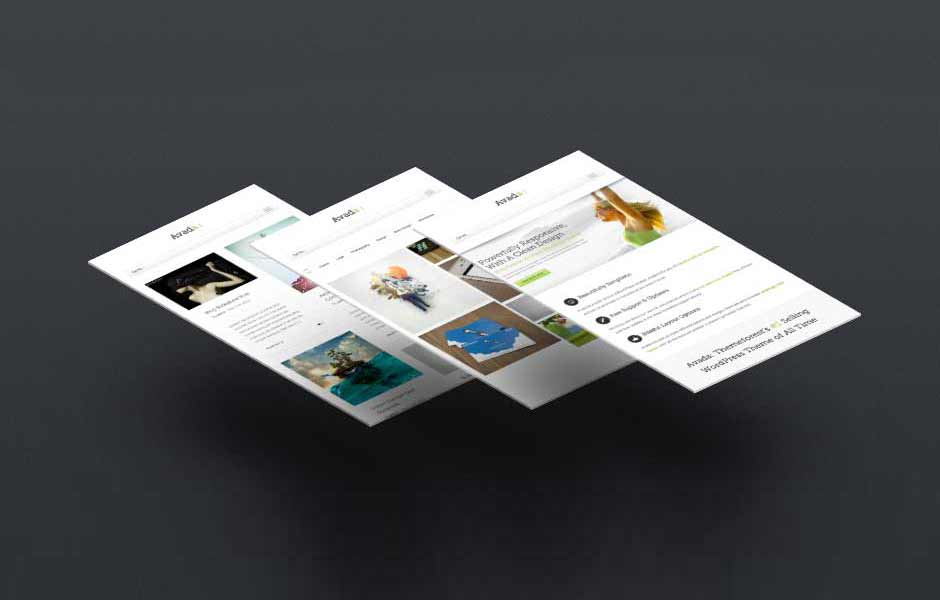
Avada includes four premium sliders that make your content stand out!Make Your Content Stand Out
Avada includes the Layer Slider, Revolution Slider, Fusion Slider and Elastic Slider.Amazing Elements
Avada offers incredible elements that allow you to create a beautiful site.Build Something Beautiful
Dozens of well designed shortcodes loaded with options gives you perfect freedom.Column Sizes
Flip boxes have their own column option to set which allows the content box to fill the column width from 1-6 columns. They can also be used inside of our regular column shortcode to control their placement on the page.
Column Sizes
Avada's column options are integrated into the flip boxes, making it easy to set 1-6 columns. Content boxes will always resize accordingly. It's a beautiful thing.Perfect For All Sizes
No matter the size of your screen or device, your site will look fantastic.Color Control
Flip boxes allow you to control the color of the backgrounds, title text, body text, icons, icon circles and borders. Set colors individually in the shortcode, or globally in our theme options panel. Take control of your colors with ease.
Control
Control all the colors of each element you see.Control Your Colors
From backgrounds to text colors to borders. Take control.Your
Control all the colors of each element you see.Control Your Colors
From backgrounds to text colors to borders. Take control.Colors
Control all the colors of each element you see.Control Your Colors
From backgrounds to text colors to borders. Take control.Icon Haven
Font Awesome Icons are tightly integrate into the flip boxes along with multiple options; icon color, circle color and border, circle show or hide, icon flip, rotate, spin and animate.
Awesome
Font Awesome Icon integration is perfect.Control Your Icons
Change just about every aspect of the icon and circle that contains it. Take Control.Icons
Font Awesome Icon integration is perfect.Control Your Colors
Change just about every aspect of the icon and circle that contains it. Take Control.Need Images? Check!
Instead of using an icon, you can choose to use an image that will show up in the same area as the icon. The settings allow you to specify the exact image size so it displays perfectly in the box. Using an image instead of an icon opens up a whole new look for the flip boxes and gives additional creative uses.

Images Love Flip Boxes
Images can be used in place of icons.A Whole New Look
Instead of using icons, you can choose to use images. This opens up a whole new look for the flip boxes and gives you more creative freedom in creating layouts.
Images Love Flip Boxes
Images can be used in place of icons.A Whole New Look
Instead of using icons, you can choose to use images. This opens up a whole new look for the flip boxes and gives you more creative freedom in creating layouts.Border Control
Flip boxes allow you to use borders and set the border width, color and radius. You can even set the border properties individually per box to make one box stand out from the others with featured content. Take control of your borders.
Control
Control the border size, color and radius.Control Your Borders
From backgrounds to text colors to borders. Take control.Your
Control the border size, color and radius.Control Your Borders
From backgrounds to text colors to borders. Take control.Borders
Control the border size, color and radius.Control Your Borders
From backgrounds to text colors to borders. Take control.Complete Set of Options
Every option and description included with the alert shortcode is listed below.
- columns – Can be one of these values: 1, 2, 3, 4, 5, or 6. Sets the number of columns per row.
- title_front -The custom title text for the front side of the flip box.
- title_back – The custom title text for the back side of the flip box.
- text_front – The custom body text for the front side of the flip box.
- border_color – Accepts a hexcode ( #000000 ). Sets the border’s color. Leave blank for Theme Option selection.
- border_radius – Accepts a pixel value that sets the border’s radius. For example, 4px. Leave blank for Theme Option selection.
- border_size – Accepts a pixel value that sets the border’s size. For example, 4px. Leave blank for Theme Option selection.
- background_color_front – Accepts a hexcode ( #000000 ). Sets the front side’s background color. Leave blank for Theme Option selection.
- title_front_color – Accepts a hexcode ( #000000 ). Sets the front side’s title color. Leave blank for Theme Option selection.
- text_front_color – Accepts a hexcode ( #000000 ). Sets the front side’s body text color. Leave blank for Theme Option selection.
- background_color_back – Accepts a hexcode ( #000000 ). Sets the back side’s background color. Leave blank for Theme Option selection.
- title_back_color – Accepts a hexcode ( #000000 ). Sets the back side’s title color. Leave blank for Theme Option selection.
- text_back_color – Accepts a hexcode ( #000000 ). Sets the back side’s body text color. Leave blank for Theme Option selection.
- icon – A font awesome icon value. For example, fa-glass.
- icon_color – Accepts a hexcode ( #000000 ). Sets the icon’s color. Leave blank for Theme Option selection.
- circle – Can be one of these values: yes, or no. Sets if the icon is circular or not.
- circle_color – Accepts a hexcode ( #000000 ). Sets the icon’s background color. Leave blank for Theme Option selection.
- circle_border_color – Accepts a hexcode ( #000000 ). Sets the icon’s border color. Leave blank for Theme Option selection.
- icon_flip – Can be one of these values: none, horizontal, or vertical. Sets the direction where the icon will flip.
- icon_rotate – Can be one of these values: none, 90, 180, or 270. Sets the angle of the icon’s rotation.
- icon_spin – Can be one of these values: yes, or no. This will enable or disable the icon’s spinning feature.
- image – The URL path of your custom icon image, starting with http:// and usually ending on .jpg, .png or .gif. Make sure there is no „icon=“ value.
- image_width – This parameter is for custom icon images. Accepts a numerical value to set a custom width in pixels. For example, 35.
- image_height – This parameter is for custom icon images. Accepts a numerical value to set a custom height in pixels. For example, 35.
- animation_type – Can be one of these values: none, bounce, fade, flash, shake, or slide. Sets the animation to use on the icon inside the box only.
- animation_direction – Can be one of these values: down, right, left, or up. Sets the incoming direction for the animation of the icon inside the box only.
- animation_speed – Accepts a numerical value from .1, which is the slowest, to 1, which is the fastest. This is only for the icon inside the box.
- class – Add a custom class to the wrapping HTML element for further css customization.
- id – Add a custom id to the wrapping HTML element for further css customization.

Neueste Kommentare